In this article we look at the new away strips for the 22-23 season
AFC Bournemouth – 5
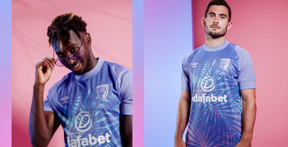
Yikes, leafy looking
Arsenal – 6

A bit to many patterns for me but have seen worse
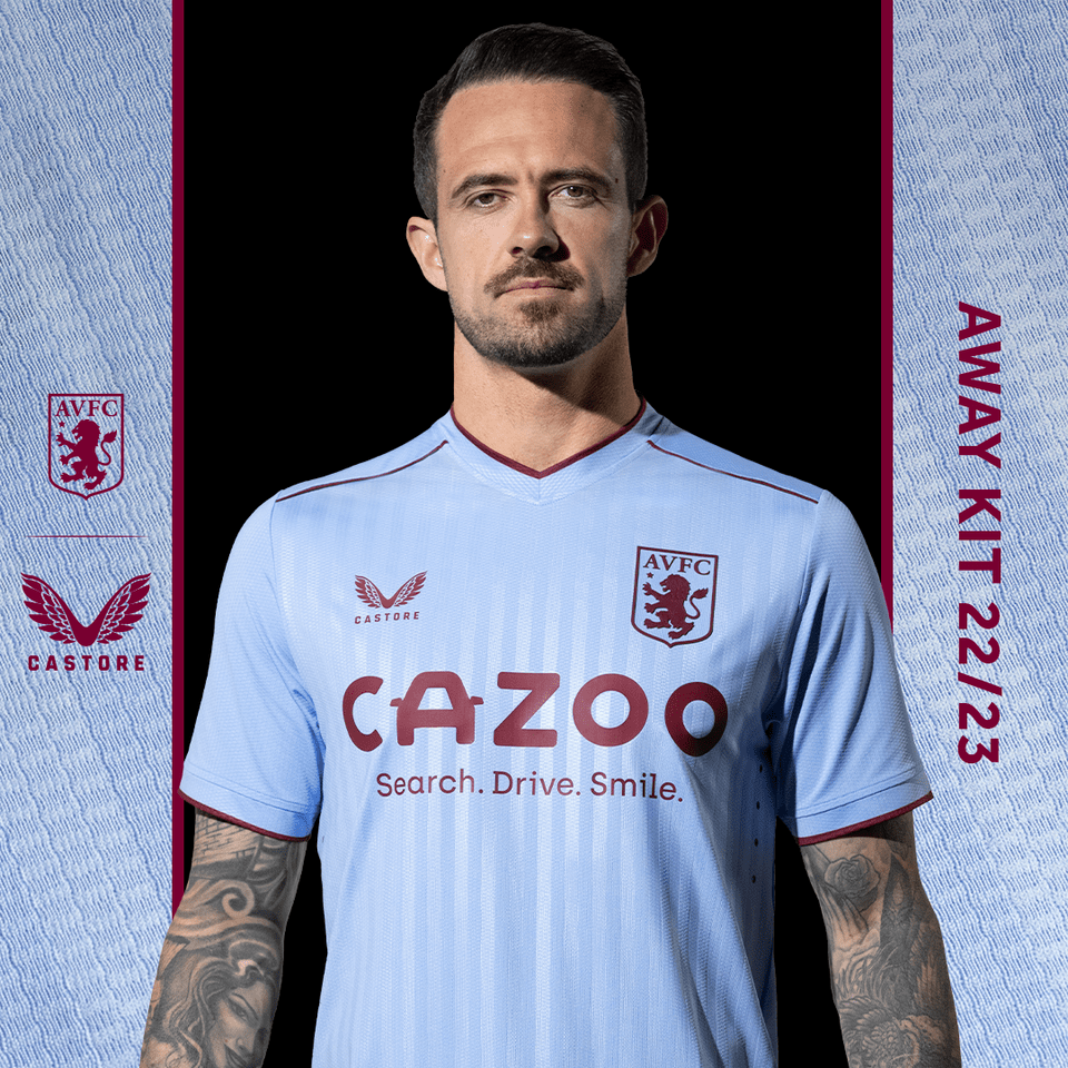
Aston Villa -7
Brentford – 6
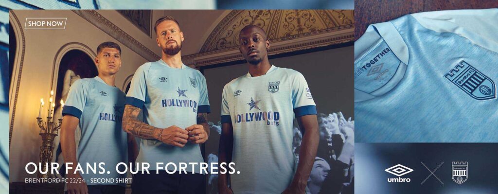
Nothing too amazing to be honest.
Brighton – 6
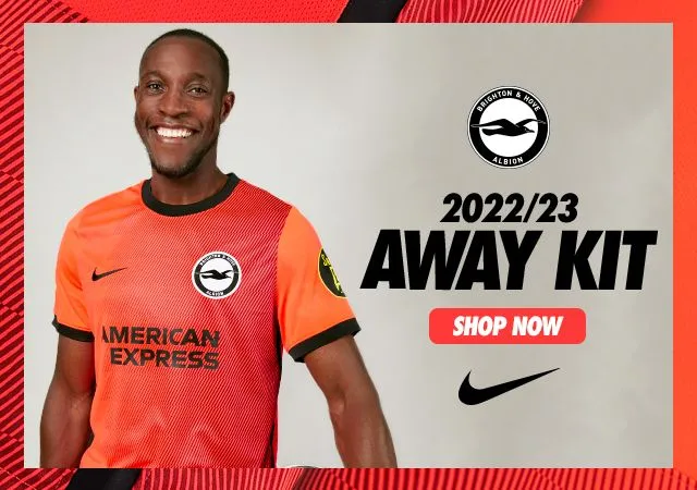
Would have preferred one colour of orange
Chelsea – 4
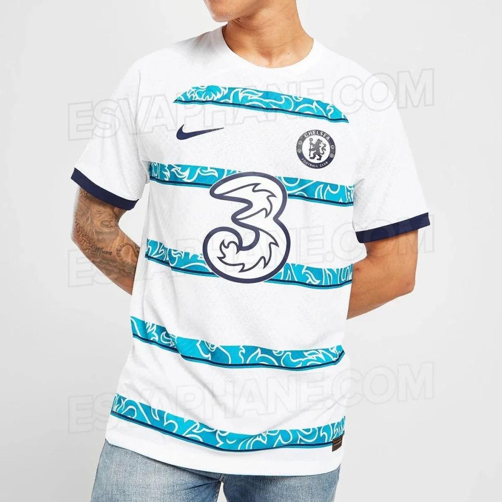
This is also not officially released I believe – looks terrible
Crystal Palace – 5
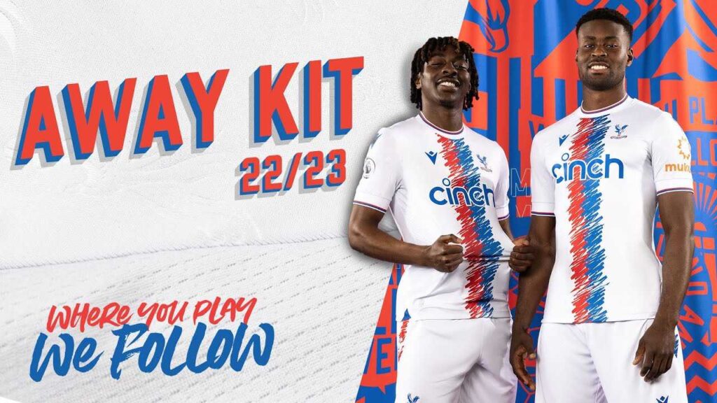
Not for me this – the brush strokes on this. Similar to the home design
Everton – 4

Awful
Fulham – 5
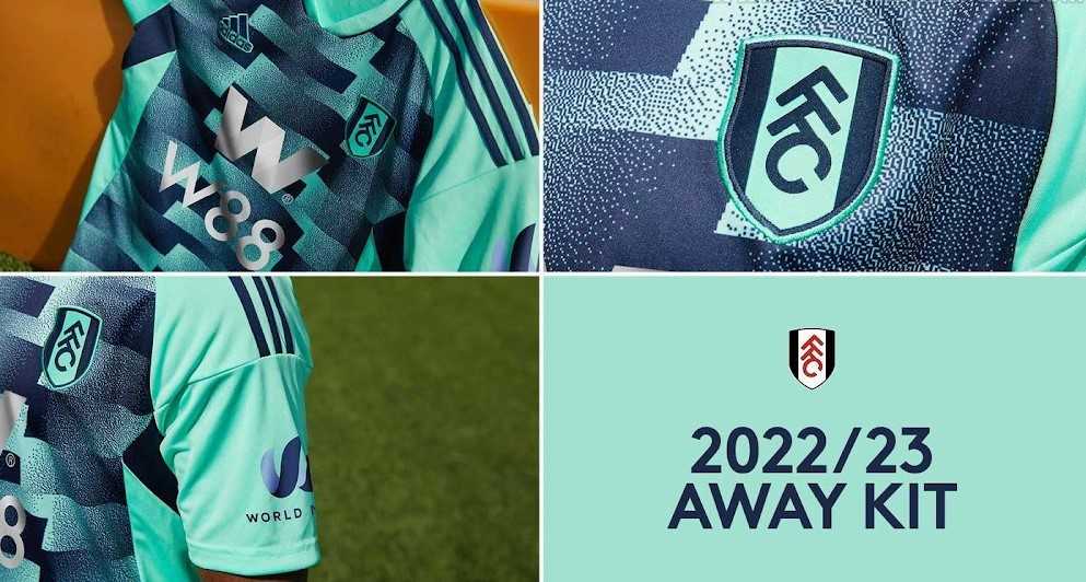
Unusual, nicest thing i can say.
Leeds
Only seen concept art – no official release
Leicester
Nowt
Liverpool – 5

Don’t like the psychedlic wavy lines
Manchester City – 6
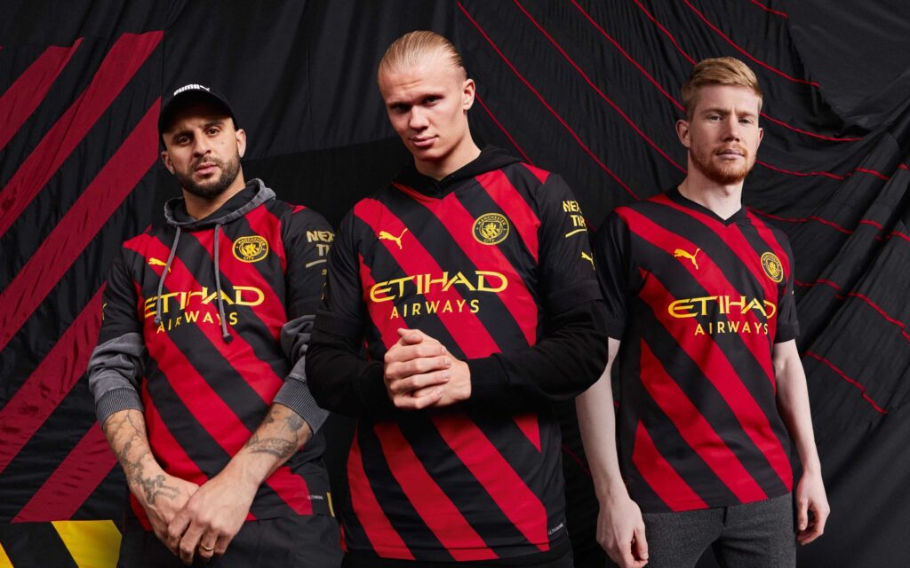
Not sure about the design – different from vertical stripes
Manchester United – 6
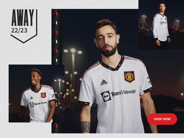
Fairly plain effort
Newcastle United – 6

Don’t like the sleeves of the random dots. Its a nice blue colour though.
Notts Forest – 5
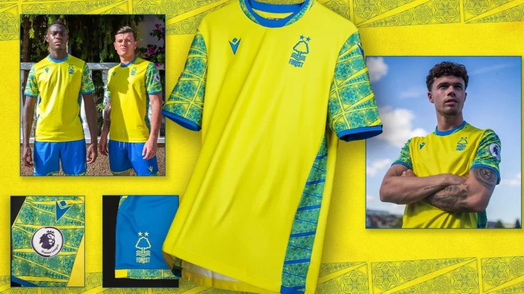
The sleeves and sides of the strip, yikes
Southampton – 4

Wow, a wavey design ???
Tottenham Hotspur – 6

Its OK
West Ham – 6
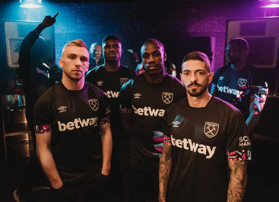
Not sure about the sleeves – like the colour
Wolves – 6

Nice colour, don’t like the patterns
